

sankai
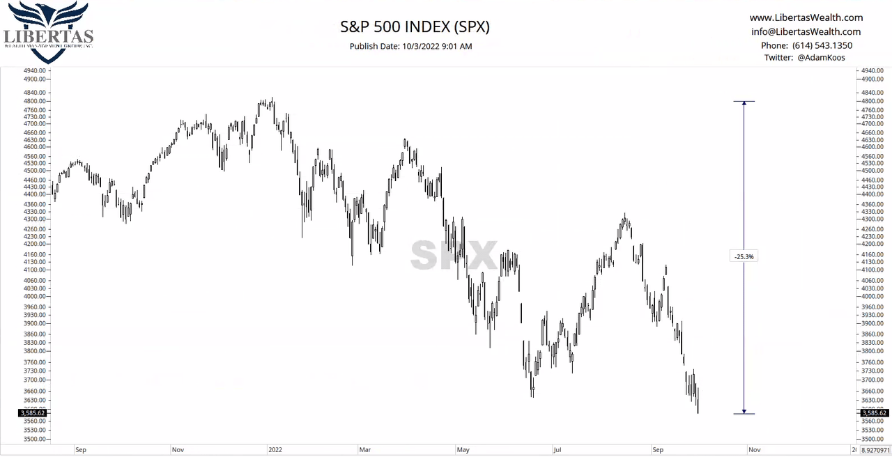
It’s the final quarter of the year, and we’re in the midst of a nasty market crash. My first picture below is the S&P 500 this year, as of the beginning of October, down more than -25%.
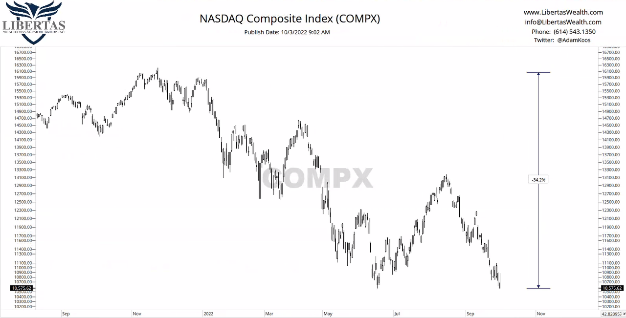
While the S&P 500 (above) represents mostly large company stocks in the U.S., the Nasdaq Composite is a much larger basket – still weighted in a way that the largest companies “carry the weight” of the price movement in the index – but it’s a little more tech-heavy, in terms of the types of stocks held in the index. You can see that it’s been down around -34% this year.
It wouldn’t be such a big deal to see stocks getting beaten up so bad if it weren’t for the fact that bonds have been pummeled as well. Here’s the U.S. Bond market, below, down around -20% over the course of the last two years.
I can’t count the number of times I’ve heard, “But I thought bonds were safe. I thought that they were supposed to do better when stocks are falling.” Well, they’ve done better on a relative basis, in that “they’re the cleanest dirty laundry” in some cases. But on an absolute basis, they’ve been disappointing, big time. Here are U.S. corporate bonds, down around -36% this past two years.
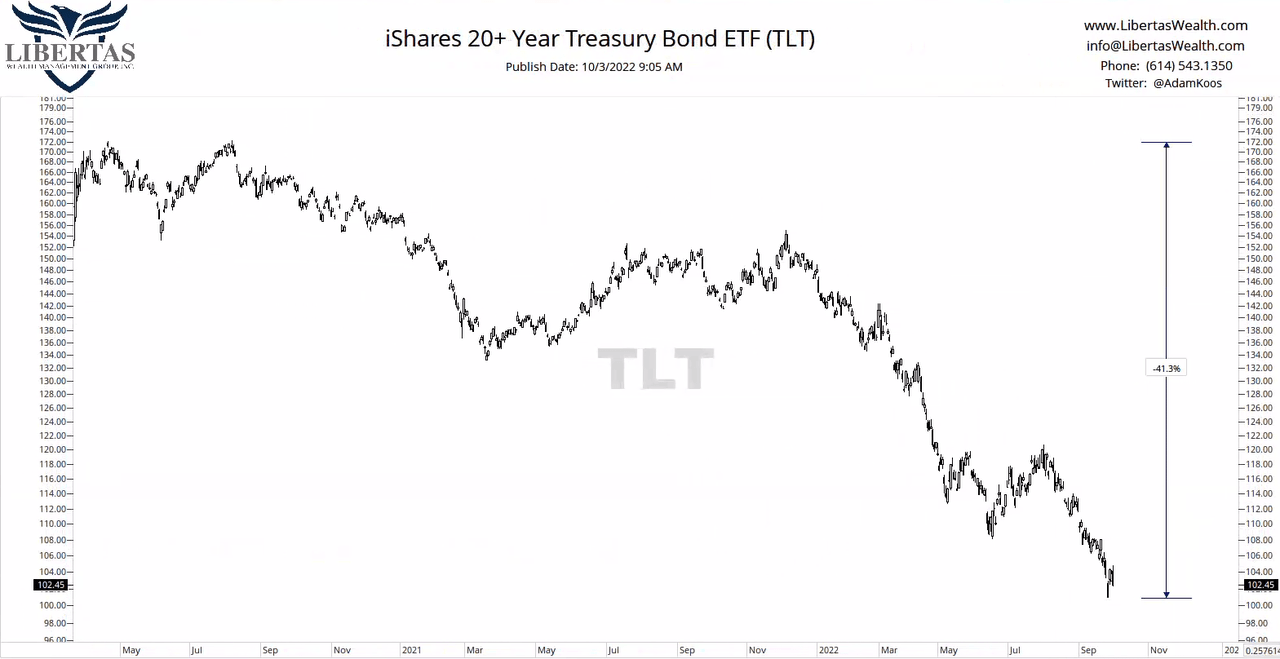
If those don’t surprise you, then this one will. Here are 20-year U.S. Treasury Bonds going back two years… down more than -40% as of the start of October. No bueno…
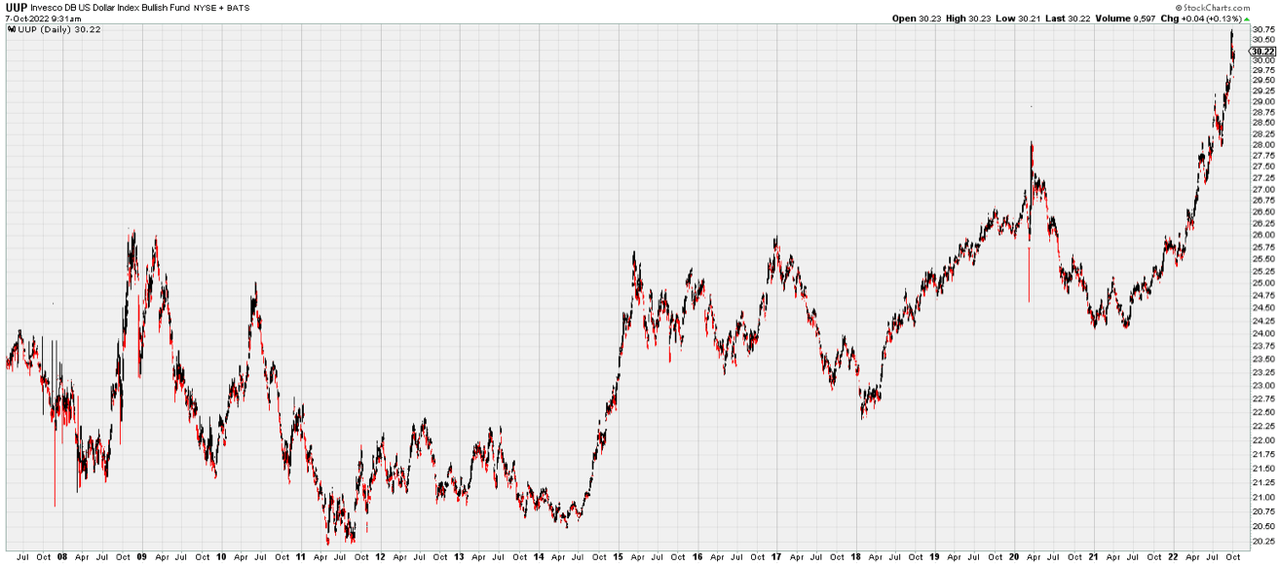
Part of the problem we’ve been experiencing in the U.S. is the fact that the Dollar has been so strong. In fact, while most financial media touts “inflation” every day of the week, we aren’t seeing a devaluation of our currency at all.
Here is the U.S. Dollar and how it’s sitting at multi-year highs. Said another way, we haven’t seen inflation yet, but when will it arrive? We’ve been talking about it for years… decades, actually!
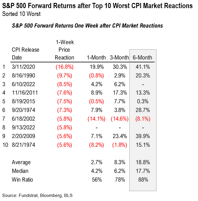
Speaking of inflation, whenever the Consumer Price Index (or CPI, which measures inflation) is reported, the stock market reacts to it – good or bad – one way or the other. Below, you can see vertical lines which represent the stock market’s 10 worst reactions to CPI releases since the late 60s. Notice how most of these reactions have occurred near major market lows.
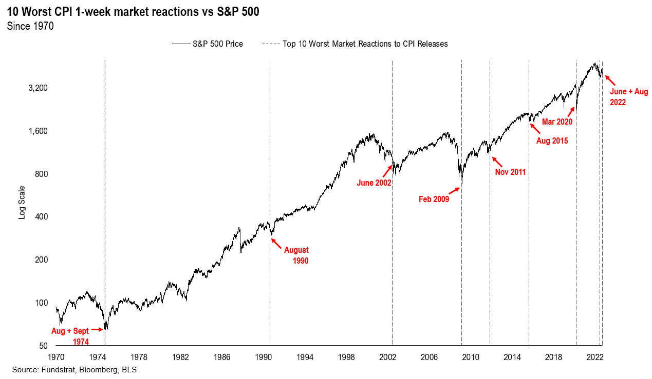
Most people will like the chart (above) better than this table (below), but what we’re looking at here is the same chart data, but here are the raw numbers. Notice the 100% win rate in the bottom right. This is telling us that, whenever these top 10 worst reactions to CPI have occurred, the stock market has been higher, 100% of the time, 1 year later!
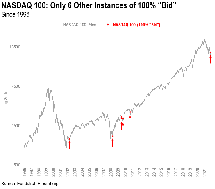
Here’s another chart and table combination that I felt was compelling. This time, instead of the S&P 500, we’re looking at the top 100 stocks in the Nasdaq. This past Tuesday, this index went “100 bid,” which means that all 100 stocks on the Nasdaq 100 were positive on the day, and this doesn’t happen very often.
As you can see below, since the late 90s, it’s only happened six times. Notice “where” these instances took place? If you say “Not near market highs,” you would be correct!
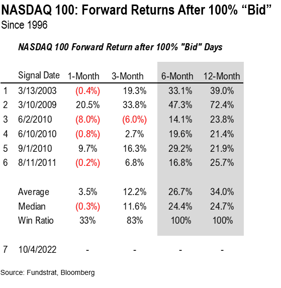
… and here’s the raw data that coincides with the chart, above. Again, notice how, when the Nasdaq 100 has gone 100 bid in the past, the index was higher 100% of the time, both six and twelve months later, with an average return of 34%. Not bad!
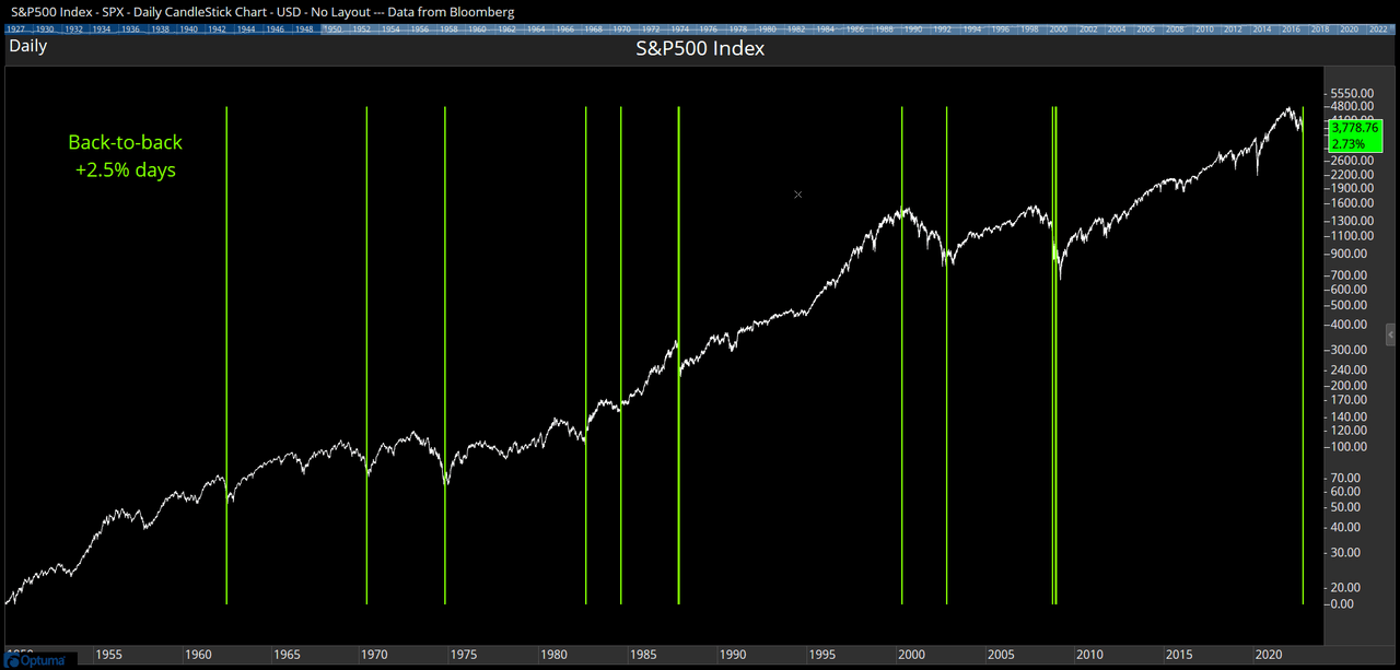
Here’s another interesting one from my friends at Optuma, the technical analysis software I personally use. There have not been too many times in history when the S&P 500 was up 2.5% or more, in back-to-back days.
The chart below show us – with vertical lines – when this has taken place in the past. Notice where these instances of back-to-back +2.5% days have taken place, and that only one was near a market top.
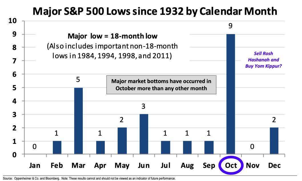
My friend Ari Wald, head of technical analysis for Oppenheimer, shared this chart just this past week. Going all the way back to 1932, it shows that the vast majority of major market bottoms have occurred in October. Not to say the present has to repeat the past, but as Mark Twain once said, “History doesn’t repeat itself, but it sure does rhyme!”
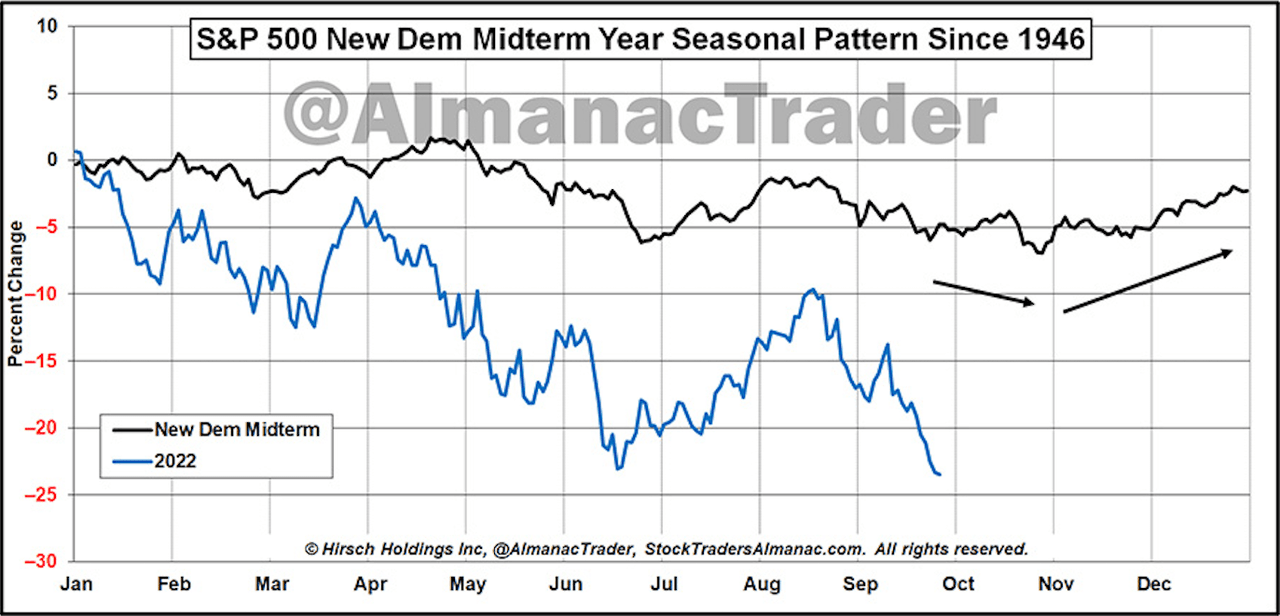
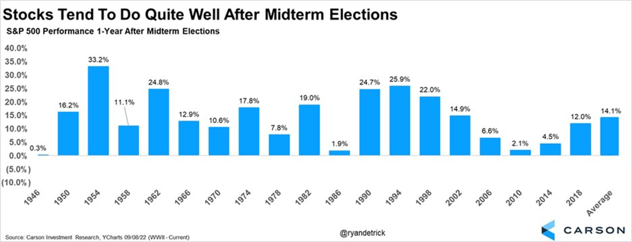
Here’s a chart that plots the average performance of the S&P 500 in every mid-term election year going back to 1946. Notice how the average tends to bottom in October? Is it possible we could see the same take place in 2022?
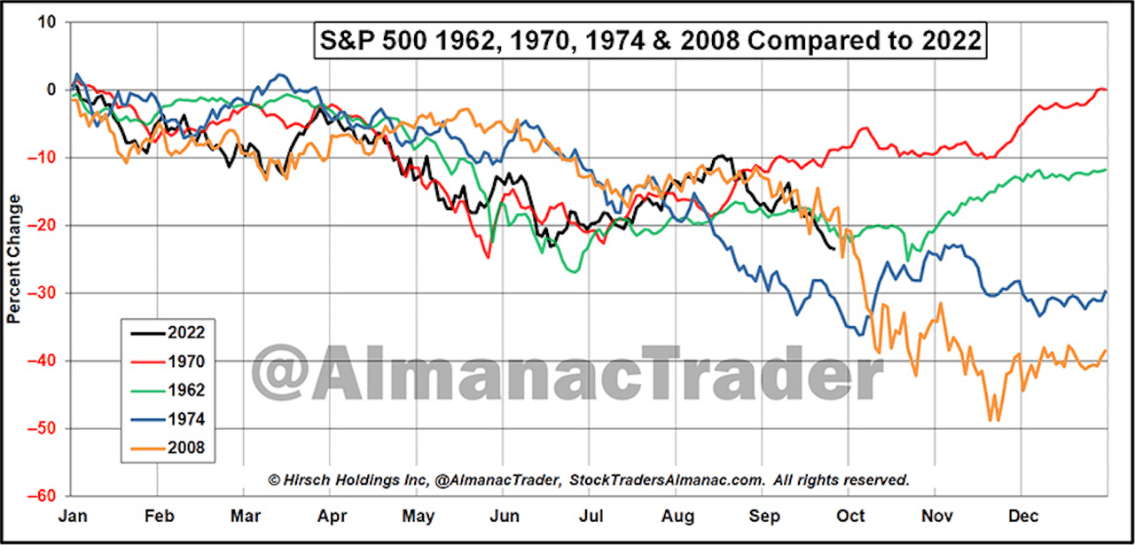
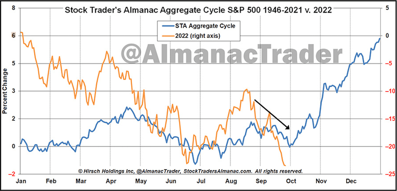
Another chart I borrowed from my friend, Jeff Hirsch (at Stock Traders Almanac) compares this year (in black) to 1962, 1970, 1974, and 2008. Notice how the latter continued down before ultimately bottoming in March of 2009 (bottom not pictured), but how all of the other three either ended the year positive in the 4th quarter.
… and below is the full, four-year cycle averaged together, going back to 1946, and you can see how (seasonally speaking, anyway), the stock market is teed up for the beginning of its historically best performing time in the 4-year election cycle.
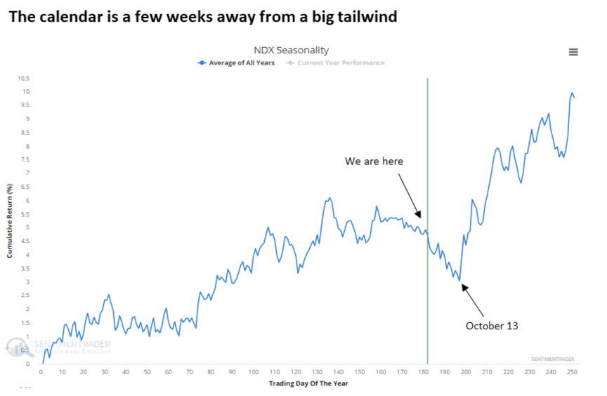
I’ve been bouncing back & forth between the S&P 500 and the Nasdaq Composite today, so I’ll do it again. Here’s a look at the average year for the Nasdaq since inception. Notice when the average bottom takes place, and how the average year finishes…
Okay – I’ve beaten the 2022 horse to death. What about next year? What does the historical data say about the pre-election year coming up in 2023? Well, going back to 1946, there has never been a negative year… never.
Does this mean that the market has to go up next year? Of course not. Depending on your emotional predisposition (combined with how much financial and political news you subject yourself to), you might believe that 2023 is surely going to be the first year it’s down!
Well… I’m not trying to convince you that it’s going to be up or down. I’m just showing you what I’m looking at on a day-to-day basis, and from there, I re-allocate our portfolios in a way that coincides with the weight of the evidence. In other words, all these charts are just that – “evidence.”
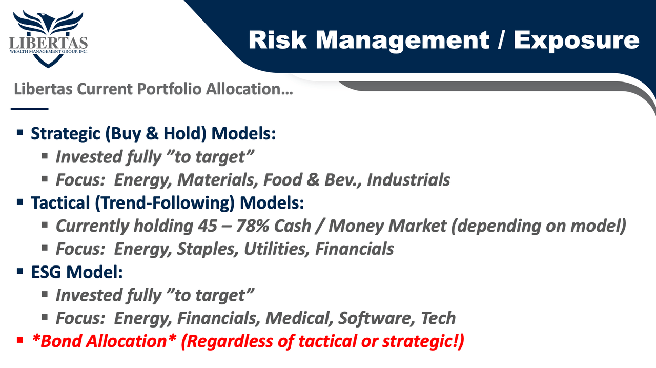
Currently, our Strategic (static/buy & hold) models are all invested “to target,” meaning they’re 100% invested in what we like to call “the playoff teams,” all while avoiding the rest of the investments that are lagging. Said another way, we’re investing in the investments that have the highest relative strength vs. the market vs. all sectors, and of course, their peers.
Our Tactical (Trend Following) models are also invested in the highest RS (relative strength) “playoff teams,” but each individual investment also has its own “extra layer” of protection. When trends on any individual investment break down (based on our proprietary trend-following strategies), we simply sell the investment and move the proceeds to cash/money market.
So, while our Strategic models are 100% invested in the “risk model” in question (i.e., aggressive, moderate, balanced, vs. conservative) our trend-following models have held anywhere between 45-78% cash/money market (selling started in February), all depending on how aggressive or conservative the model.
Meanwhile, below is the corresponding slide (including our current sector focuses).
As always, I hope this report helped add objectivity and honest perspective to what’s going on in the markets today.
Original Post
Editor’s Note: The summary bullets for this article were chosen by Seeking Alpha editors.